Architect in the spotlight: Emmanuelle Colboc & Associés
Emmanuelle Colboc et Associés: projects with a human touch
Emmanuelle Colboc has been working in Paris as an architect for over 30 years. A few years ago, she founded her own agency, Emmanuelle Colboc et Associés, with three colleagues. Today, the agency employs about a dozen employees, focusing mainly on the design of hospitals, schools, public facilities and housing. Regardless of how diverse these projects may be, they are all centred around people, and they have a soul and a touch of character to ensure the occupants and users feel right at home. The architects always try to bring in as much natural light as possible, because they see it as the ultimate source of well-being.
“I love working on projects with a great focus on people, in which the technical aspects must adapt to the well-being of the location's users", says Emmanuelle Colboc.
Natural light and warmth
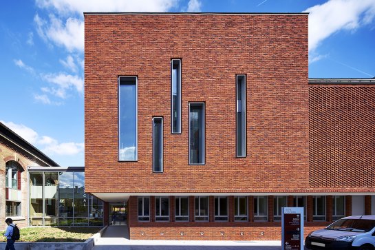
This project focuses on the extension of the ophthalmology centre of the Cochin hospital, which is currently housed in a XIXth-century wing on one of the historical axes of the building. The new building, which is the same size as the existing wing and will be built symmetrically, is compact and surrounded by tall, large blocks. To allow as much natural light as possible into the new extension, the architects are placing a glass element on the façade between the two buildings, creating a patio reminiscent of the old patio. They are also installing skylights on the roof, which let light shine into each patio and illuminate the gable of the old building, currently the interior façade of the entrance hall. The new building is articulated around the patio which is used as the reception hall for the consultation rooms and leads to the emergency ward. The operating theatres are located on the first floor, which resembles a balcony onto this patio, that lets in natural light and creates a sense of warmth. As the operating theatres themselves are on the side of the façade, they benefit from natural light. Above the entrance hall, there is a spacious, double-height waiting room with large windows between the first and the second floor. This hall for day-hospital patients bathes in pleasant natural light and boasts framed views of the old scenery.
The choice of bricks
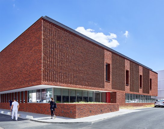
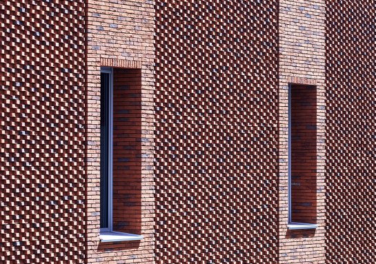
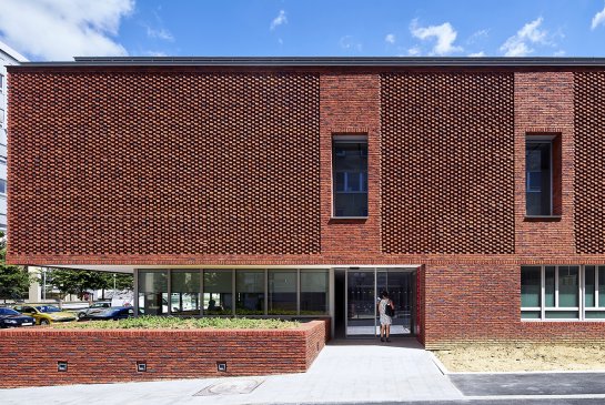
The bricks were chosen for several reasons. Firstly, since the new brick extension is a nod to the old XIXth-century wing, the architects deemed it fit to use the same material. Secondly, as the building is surrounded by two large blocks, they needed to make sure its outline would not be swamped by its surroundings. They therefore opted for a sober look. The architects designed a breezy glass ground floor and contrasting solid brick façades. With the exception of a few large corner windows above the entrance, the first floor is entirely covered with bricks, placed at an angle, creating a striking, unassuming look. This playful brickwork on the façade ensures a strong, solid contrast with the neighbouring buildings. The bricks used are Nelissen Rosina, which perfectly met the architects’ colour demands. Their rusty hue works well with the terracotta roof tiles of the old building and gives the façades of the new building a sturdier look. The architects set out to find solid, elegant materials that would blend in well with the neighbouring building and the roof, rather than with the pink ochre shades of the existing façade. Another red façade down the road boasts the same style as the new building.


Emmanuelle Colboc has been working in Paris as an architect for over 30 years. A few years ago, she founded her own agency, Emmanuelle Colboc et Associés, with three colleagues. Today, the agency employs about a dozen employees, focusing mainly on the design of hospitals, schools, public facilities and housing. Regardless of how diverse these projects may be, they are all centred around people, and they have a soul and a touch of character to ensure the occupants and users feel right at home. The architects always try to bring in as much natural light as possible, because they see it as the ultimate source of well-being.
“I love working on projects with a great focus on people, in which the technical aspects must adapt to the well-being of the location's users", says Emmanuelle Colboc.

Natural light and warmth
This project focuses on the extension of the ophthalmology centre of the Cochin hospital, which is currently housed in a XIXth-century wing on one of the historical axes of the building. The new building, which is the same size as the existing wing and will be built symmetrically, is compact and surrounded by tall, large blocks. To allow as much natural light as possible into the new extension, the architects are placing a glass element on the façade between the two buildings, creating a patio reminiscent of the old patio. They are also installing skylights on the roof, which let light shine into each patio and illuminate the gable of the old building, currently the interior façade of the entrance hall. The new building is articulated around the patio which is used as the reception hall for the consultation rooms and leads to the emergency ward. The operating theatres are located on the first floor, which resembles a balcony onto this patio, that lets in natural light and creates a sense of warmth. As the operating theatres themselves are on the side of the façade, they benefit from natural light. Above the entrance hall, there is a spacious, double-height waiting room with large windows between the first and the second floor. This hall for day-hospital patients bathes in pleasant natural light and boasts framed views of the old scenery.

The choice of bricks
The bricks were chosen for several reasons. Firstly, since the new brick extension is a nod to the old XIXth-century wing, the architects deemed it fit to use the same material. Secondly, as the building is surrounded by two large blocks, they needed to make sure its outline would not be swamped by its surroundings. They therefore opted for a sober look. The architects designed a breezy glass ground floor and contrasting solid brick façades. With the exception of a few large corner windows above the entrance, the first floor is entirely covered with bricks, placed at an angle, creating a striking, unassuming look. This playful brickwork on the façade ensures a strong, solid contrast with the neighbouring buildings. The bricks used are Nelissen Rosina, which perfectly met the architects’ colour demands. Their rusty hue works well with the terracotta roof tiles of the old building and gives the façades of the new building a sturdier look. The architects set out to find solid, elegant materials that would blend in well with the neighbouring building and the roof, rather than with the pink ochre shades of the existing façade. Another red façade down the road boasts the same style as the new building.
